
HelloSign redesign
From 2019 to 2022, my team redesigned and rebranded HelloSign. This comprises multiple projects, the most important one was the core flow redesign in 2020.
THE TRANSFORMATION


IMPACT
2.5X conversion
User trust from a recognizable brand
Quality & speed from a robust design system
CONTEXT
The core flow project started with a 6-month technical rewrite from PHP to React. We were growing quickly, and the tech stack was slowing us down due to the front-end and back-end both tied to PHP. We also couldn’t implement the React-based Dropbox Design system. It meant a slow experience for customers and difficulty in shipping quickly.
PROBLEM DEFINITION
During planning, thinking that we can take this chance to understand the quality of the core flow, I advocated for evaluative research.
The team ran a quant study using SUS. We found that most users can complete the flow, but they do it with errors. Most of these errors are due to the flow being complicated, having multiple paths that users can go down, as well as little guidance to help users figure out what steps they need to complete.
Core flow is complicated
SUS result
SOLVE THE RIGHT PROBLEM

Looking at the quant data, only 1 in 5 first-time users actually finish this flow. It’s clear that this is a sub-par experience. The Designer and I agreed that we should aim to significantly improve this flow if we plan to spend 6 months rewriting it.
I helped my Designer in putting a case arguing for a redesign and aligned our leadership team to expand the scope of this project.
We aligned to the user problem:
How Might We minimize errors and guide users during first-time use?
and the measurable goal: Improve first-time conversion
ITERATION
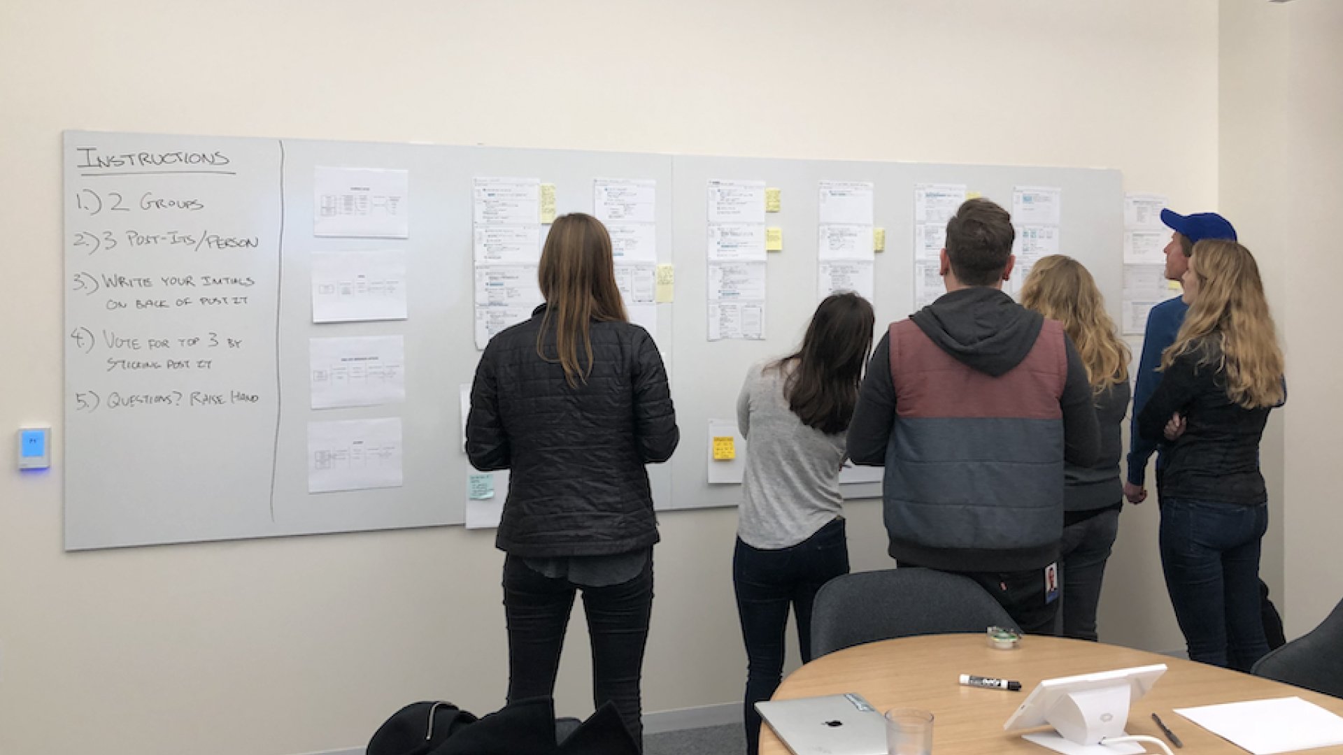
Team went on a workshop to brainstorm together
I review the work regularly and coach the team through important decisions. Here’s an example:

Concept 1

Concept 2
The team brought 2 well-tested concepts for feedback. Concept 1 shows one step at a time while concept 2 is similar to the “Typeform” experience. We debated what it truly means to choose one path vs the other, I decided that we should optimize for clarity and scale.
Clarity: It’s clearer in Concept 1 what users can expect as next steps
Scale: It will be difficult to add more content to each step in Option 2, and it will eventually require us to paginate
Hence, concept 1 was chosen. “Make it simple & clear” became a design principle and this decision was used as an example of that principle.
RESULT
This was our most successful project in 2020 and set the stage for Design’s strategic impact in our subsequent redesign efforts.

REBRANDED EXPERIENCE (2022)
In 2022, we implemented Dropbox Design system and rebranded into Dropbox Sign. Executing the redesign before the rebrand set us up for success, ensuring that the experience is both usable and consistent with Dropbox design quality.


